#86 May Status Report
May 20, 2014
This month we’ll have a preview of a new addition to the EnterTRAINment Junction (EJ) layout and a look at the results of a further lighting upgrade in the Middle Period city.
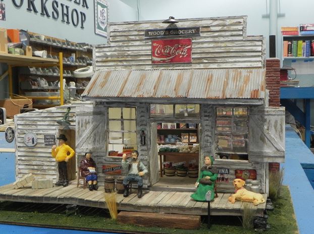
Another exquisite model, this time of a mid-20th Century store, Wood’s Grocery (Figure 1), was built for the area surrounding the Middle Period city. It’s shown here while still in the EJ workshop. Its exact location on the layout was not yet certain at the time of this writing, but judging by the outstanding quality and detail of the model, it needs to be near the aisle, so that visitors can easily see it and appreciate it.

Figure 1. Wood’s Grocery Store
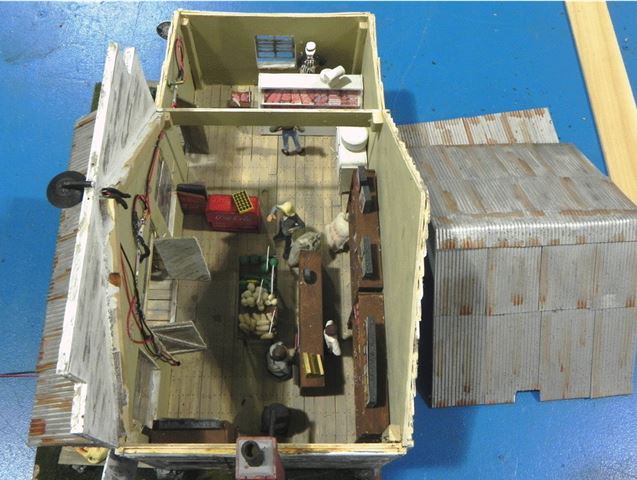
This pre-installation preview allows us to look inside much more easily than we could once it’s installed (Figure 2). Notice the fully stocked meat counter and scale, the old-style refrigerator, the coke cooler with the case of coke bottles on top, the bin with fruits and vegetables, the boxed products on the shelves, and the old pot bellied stove. The wiring for the lighting along the front wall will, of course, not be visible through the doors and windows once the building has been installed on the layout and the roof is put in place.

Figure 2. Interior of Wood’s Grocery Store
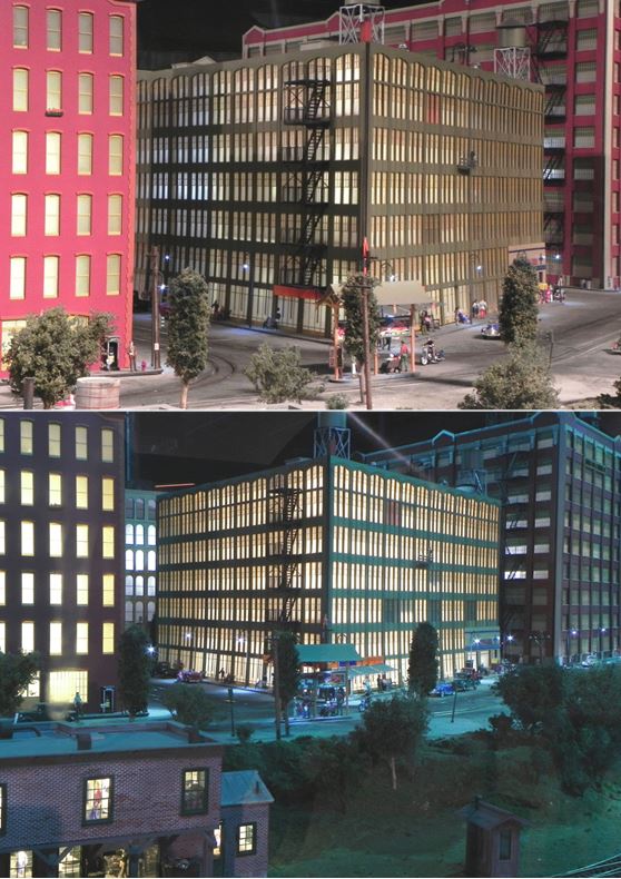
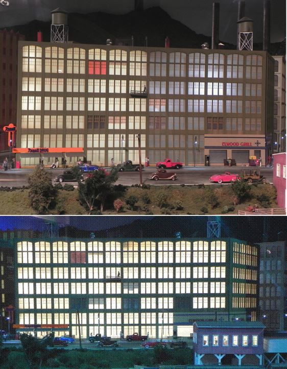
In the process of upgrading the lighting in the buildings in the Middle Period city, the volunteers have encountered a number of challenges. The building with the Rexall Drug Store in one corner presented another of those challenges recently. The problem was getting even lighting to the windows adjacent to the sharp angle of the intersecting walls at the corner of the building where the drug store is located. The sharp angle of the adjoining walls requires lighting to be pointed into the corner, but that could allow a direct view the lights, which creates unrealistic bright spots if not properly hidden or diffused. Two such bright spot are seen in the upper views in Figures 3 and 4, in the left part of the building in Figures 3 and the right part of the building in Figure 4. These resulted from the bright-white LED bulbs used in the building’s original centrally located lighting.
The upgraded lighting in the drug store corner in these views, on the other hand, is much warmer (consistent with the incandescent lighting of the period) and much more even. Warm-white LED light strips were installed horizontally between floors; some were aimed at the usual reflective freezer-paper curtain, while others were aimed at wall with the fire escape, where another curtain was installed just inside the windows. This curtain did double duty, reflecting light back to the windows in the corner on the adjacent wall as well as transmitting and diffusing the light through the curtain to the windows on the fire-escape wall. This latter curtain also prevented the lights from being seen directly through the fire-escape wall’s windows.
For comparison, the lower parts of Figures 3 and 4 show the building with all the light strips and reflective curtains installed, upgrade completed.

Figure 3. The Rexall Drug Store Building Lighting Upgrade
(partial – top; complete – bottom)

Figure 4. Rexall Drug Store Building Lighting Upgrade 2nd View
(partial – top; complete – bottom)
As the new lighting challenges a met, the lessons are applied to other buildings with similar characteristics. And so the work continues.
© 2014 Tom Bartsch
MVGRS Big Train Project Coordinator

 Tickets
 Parties
 Shop
Shop Directions