#70 January Status Report
January 25, 2013
The Big Train Project Status Report (Part 70)
This report hopes to shed some light on some of the techniques used to model large multi-story buildings with interior lighting on the the EnterTRAINment Junction (EJ) layout.
When EnterTRAINment Junction opened in 2008, a majority of the buildings in the Modern city were made of Gatorboard ® with computer printed facades laminated onto the surface. The facades included brickwork, windows, and other details. The windows were solid parts of the wall providing no opportunity to show light from the interior of the building. The building on the left in Figure 1 shows such a building using the solid printed facades. This style of building worked well enough initially, both in the foreground and in the background on the layout. However, as improvements were made to the layout, these buildings were replaced and the materials they were made of were used to make background buildings which were later upgraded with actual window openings, window frames, interior lighting, and in some cases interior detail. The implementation of the day-dusk lighting cycle on the layout provided the impetus for upgrading most of the older unlit buildings to show some interior lighting. Even the background buildings needed the upgrade, all intended to make the layout look more realistic. A number of techniques were used for upgrading or replacing buildings to show some lighting through the windows.
The building on the right in Figure 1 is one such upgraded building with window openings, window frames with glazing, interior lighting, and interior detail on the lower floors. See Figure 4 for the detailed interior hiding behind those upgraded façades.
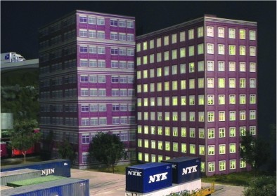
Figure 1. Old Style Façade Building and Upgraded Façade Building
For office buildings with large windows, curtains or drapes are unlikely. One technique to address un-curtained windows was to cut window openings in the facades and cover the openings with a translucent sheet with mullions taped or drawn on them. This would avoid the need to add interior details, which would not be visible through window coverings. Silhouettes on the window covers give an indication that the building is occupied and in use (Figure 2).
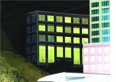
Figure 2. Silhouettes on Translucent Windows
A second translucent window covering technique is window curtains or drapes. These were simply printed on paper and glued behind the window openings cut into the Gatorboard. To add more detail, window frames with mullions could be added to the outside walls. In Figure 3 the lit building in the center shows the implementation of this technique, with old-style façade building to its right and left.
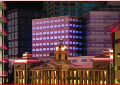
Figure 3. Curtains and Window Frames with Mullions
For buildings close enough to the EJ visitor to require more detail, full or partial interiors provide a significant, though high-workload, way to improve a building. Figure 4 shows such an interior, which was incorporated into the building shown at the right in Figure 1. The lower floors represent offices, where drapes are not appropriate, so the windows have transparent glazing (clear plastic) without covering. The upper floors represent apartments of condominiums which could have most windows covered by drapes. This requires a minimum of interior detail, related only to the few windows which would have the drapes pulled back. Figures looking out of the windows with the open drapes provided additional detail.
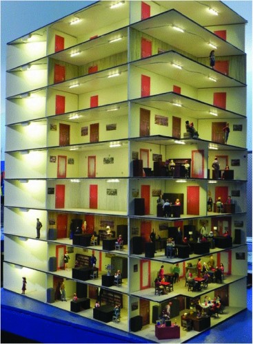
Figure 4. Detailed Interior
A third technique for adding lighting is to have transparent windows without covering and with the office interiors represented by façade images of office interiors recessed some distance (e.g. four inches) behind the windows (Figure 5). This provides some degree of three-dimensionality without the need to actually build the detailed interiors. The result is passable at distances of more than about 20 feet away from the viewer.
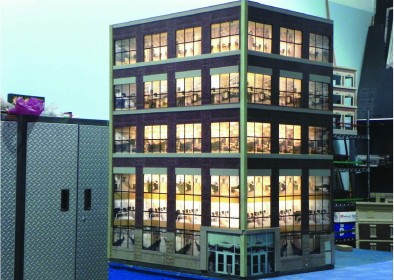
Figure 5. Interior Facades
A final technique used on the EJ layout was to mimic the appearance of buildings with reflective exterior window walls. Facades of reflective plastic mounted on half-inch Gatorboard, which became excess after the foreground buildings in the Modern City were replaced, were used for this technique. While on real buildings, some light could pass through the reflective coating, the walls used on the layout were opaque, so interior lighting would be useless. However, if the building is placed near other lit buildings, the lack of interior lighting might not be noticeable. The two-sided reflective building in the center of Figure 6, showing blue reflections of the curtained building on the left and blue reflections of the interior-façade building on the right, illustrates this point. Also notice the “clear” reflective building in the lower left of Figure 6 performing a similar function.
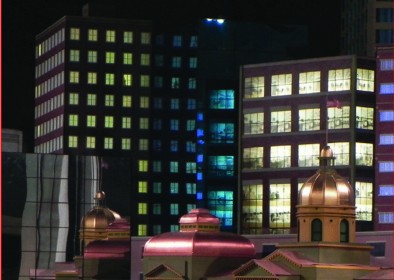
Figure 6. The “Blue Building”
In an effort to make good use of existing materials while producing the needed realistic-looking models, the EJ volunteers have devised these methods as part of the continuing program of upgrades of the EJ layout. Cutting window holes in the Gatorboard facades, assembling and installing window frames, and producing modeled interiors is a tedious and time-consuming process. It’s worth it for building up close to the EJ visitor, but may not be worth the time and resources for background items which are far away from the viewer. The volunteers have tried to balance the complexity of the modeling and the value it adds to layout with the difficulty and cost of producing the models. I believe they’re succeeding as the layout upgrade efforts continue.
© 2012 Tom Bartsch
MVGRS Big Train Project Coordinator

 Tickets
 Parties
 Shop
Shop Directions