#32 Status Report
June 2, 2009
(The Tale of Two Cities – Part 2)
As promised last month, this is the second installment of the tale, showing you the development of the Middle Era City, which currently does not have an official name. The Cincinnati club’s Mike Crone was the original “architect” for much of the design, which, like most areas on the layout, evolved over time to accommodate constraints of time and the need for simplicity. Unfortunately, Mike has had health issues which have prevented him from participating to the degree that he had hoped. Nevertheless, much of his vision has been realized, and the City is now another eye-popping showpiece of scale modeling.
The buildings of the Middle Era City are built in 1/24th scale throughout, a small departure from the 1/29th scale of the trains running around them. Its benefit is to allow the use of 1/24th and 1/25th scale period automobile models and scale figures, for which a larger variety of styles are available commercially than for other related scales. This is a bit different from the selective compression method used in the Modern City, where the scale varies from 1/24th next to the aisle to 1/29th for the trains to 1/32nd for the buildings and vehicles inside the surrounding tracks.
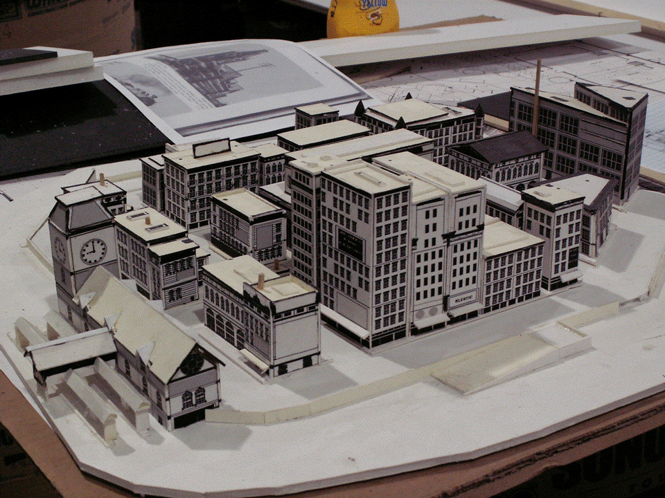
Figure 1 shows Mike Crone’s planning model with the elevated central core surrounded by a lower-level area for the mainline tracks.
 |
| Figure 1 Middle Era City Planning Model, 31 Mar 2008 |
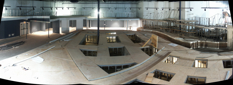
Figure 2 shows a panorama of the completed tables with the openings which would be covered by the buildings in each city block. Note the offset in the street running left-to-right at the very center. The offset was intended to prevent a viewer from looking all the through the city from one side to the other. Also note the diagonal trough in the foreground. This was intended to accommodate two tracks that were part of short loops on the mainline level. What looks like an open trap door at the right end of the trough is actually a temporary building façade used to illustrate the size of buildings in the city.
 |
| Figure 2 The Tables Complete, 26 Sep 2007 |
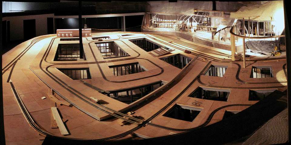
As planning and construction progressed, it was determined that the offset in the central street would make the trolley track much harder to install and its curves would generate unnecessary wear and reliability problems. Figure 3 shows the resulting rebuild and the routing of the trolley line.
 |
| Figure 3 Trolley Track Laid, 26 Mar 08 |
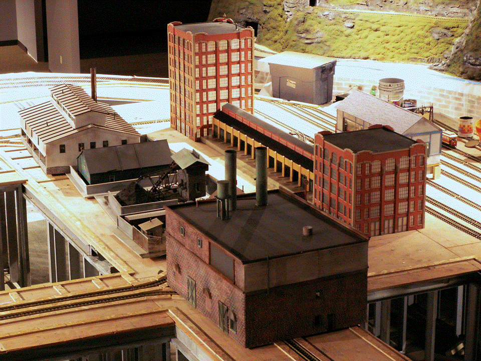
One of the chief characteristics of a trolley line is that the track is imbedded in the streets along which the trolleys run, with the top of the rail at street level. To model this would require either cutting a trough for each of the rails or raising the street level to rail height. The latter was much simpler, so that was the method used. Figure 4 shows the beginnings of the street elevation work. It also shows the first of the buildings built by John Kitterman (the red buildings with the connecting loading structure) using his numerically controlled machines. The building in the foreground, sitting on the trolley track, were placed there temporarily while work was done on the street leveling in the area where they were to be located.
 |
| Figure 4 The First Buildings, Some in Temporary Locations, 23 Jun 2008 |
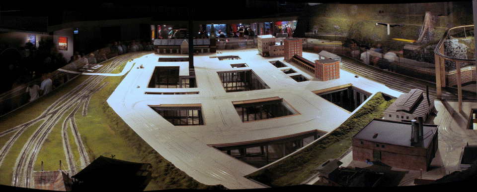
Figure 5 shows the streets and trolley track completed, Mike Crone’s Union Station in place in the distance, and the buildings shown in temporary locations in Figure 4 returned to their proper location at the lower right. Note that scenery material has been added, including in the diagonal trough, which no longer accommodates the two tracks originally envisioned. It was not deep enough to allow realistic vertical clearance under the bridges for the streets and trolley tracks that cross at each end of the trough. So the trough became a dry drainage canal. (The black shape in the left foreground is the roof of the fire lookout tower that’s located just below the mezzanine windows.)
 |
| Figure 5 The Streets Elevated to Track Height, 15 Jul 2008 |
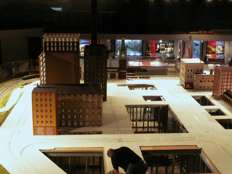
Figures 6 and 7 show the buildings of John Kitterman’s second delivery. The “black shape” in the foreground of Figure 6 is the ubiquitous Ray Hughes, fixing something that needed work.
 |
| Figure 6 More Buildings from John Kitterman, 18 Jul 2008 |
 |
| Figure 7 The Front Street Facades, 18 Jul 2008 |
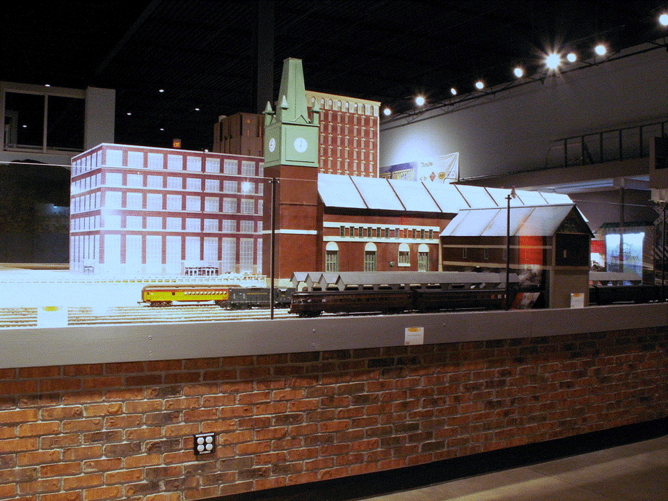
As the 1 Aug 08 opening day approached, it was clear that not all the buildings would be ready, so a couple of our modern-city computer-printout facades were used to create a temporary building in the block just behind Union Station to hide the hole in the table (Figure 8). In addition, two-foot high walls of black 3/16” Gatorboard were installed around all of the city blocks closest to the aisle that did not yet have any buildings (remaining walls can be seen at the far right of Figure 12).
 |
| Figure 8 Union Station, 1 Aug 2008 |
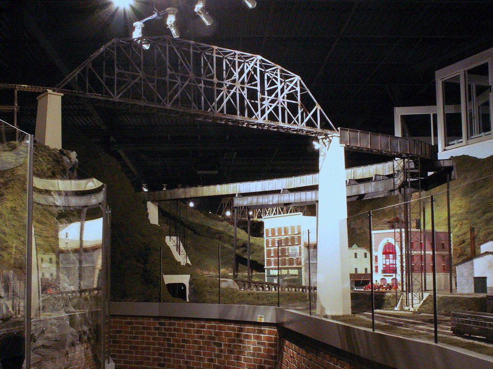
One of the challenges for the layout bridge builders was the 9.5-foot-high track which crosses the aisle just past the walkway tunnel entering the Middle Period. This line comes out of the mountain by the coal mine and crosses the back of the city curving back toward the mountain on the other side of the walkway tunneled and then crossing in front of the mezzanine by the waterfall. Several problems needed to be solved. The bridge was very high above the table, requiring unusual supports. The supports could not be located where they would block the streets or the trolley line. And, the bridge was curved. The solutions were elegant even if they were unusual. The span across the aisle was a straight truss bridge supported by masonry abutments. This transitioned into a curved plate girder bridge supported by a “second stage” of plate girders below it, which were located so that its spindly steal truss and column vertical supports did not interfere with the streets (Figure 9). Underneath the bridge stands a beautifully modeled fire house with its curved-top portico and period fire engines.
 |
| Figure 9 The Curved Bridge, 22 Aug 2008 |
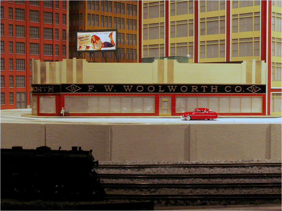
Little details to add interest were located at the edges of the layout next to aisle. This included a drive-in theater, complete with refreshment stand, speaker stands, and playground (Figure 10) located adjacent to the mezzanine stairs. That scene brings back memories for some of us, as does the F.W. Woolworth Co. store, examples of which were found in almost every town and which many of us older folks frequented in our youth (Figure 11).
 |
| Figure 10 The Drive-In Theater, 22 Aug 2008 |
 |
| Figure 11 The Woolworth Building, 22 Aug 2008 |
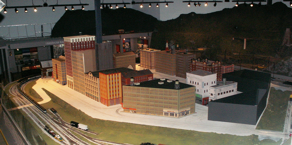
John Kitterman continued deliveries of buildings he completed, filling up more and more of the city blocks. By early November 2008, only the very center of the city and the back edge still had vacant blocks (Figure 12). Some of the noteworthy new additions were the theater at the far left and the building at the center. The latter included a Rexall drug store at one corner (about as common throughout the US as Woolworth’s) and a diner at the other corner.
 |
| Figure 12 More Buildings and Rooftop Detail, 11 Nov 2008 |
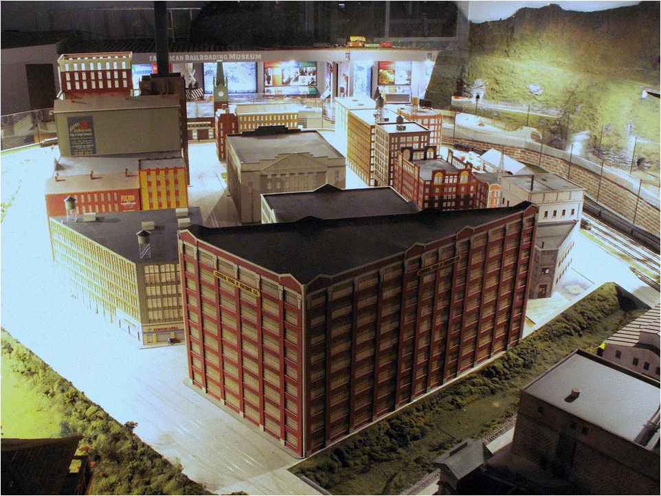
By early December 2008 the rest of the buildings had been delivered (Figure 13), including the very large triangular building in foreground and the impressive Art Deco style City Hall at the very center.
 |
| Figure 13 , Center-City Buildings All In, 1 Dec 2008 |
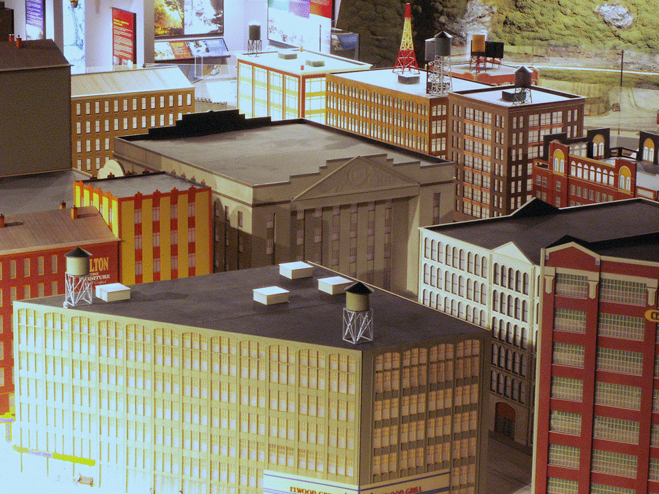
With all of the buildings installed in the central city, it took on the usual crowded appearance of most big cities, a familiar-looking scene when viewed from the mezzanine (Figure 14). The only sad note is that it’s hard to see some of the exquisite modeling that has gone into the buildings in the center, like the City Hall.
 |
| Figure 14 , Art-Deco City Hall (Center), 1 Dec 2008 |
Although buildings are the principal features of the city, it’s small details that give it life. Trees and shrubs on embankments (Figure 15), automobiles and trucks on the streets, people on the sidewalks – these all add to the character and feel of the place and give it a sense of completeness. There’s a lot more of this to be done. Some of the streets still need sidewalks, most of them need more cars, and all of them need more people; but these will all be added as time goes by.
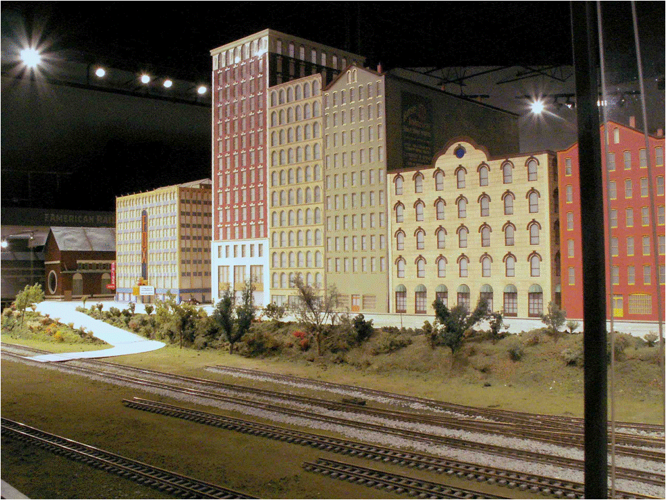 |
| Figure 15 Front Street with More Vegetation, 1 Dec 2008 |
Finally, there’s still a lot of area between the aisle and the tracks that can be filled with items and scenes interest. One of the most impressive recent additions is the Hughes Manufacturing Company (Figure 16). Fortunately, it’s located right next to aisle so that visitors can see and appreciate the details of the building and its interior, with its machine tools and manufacturing equipment.
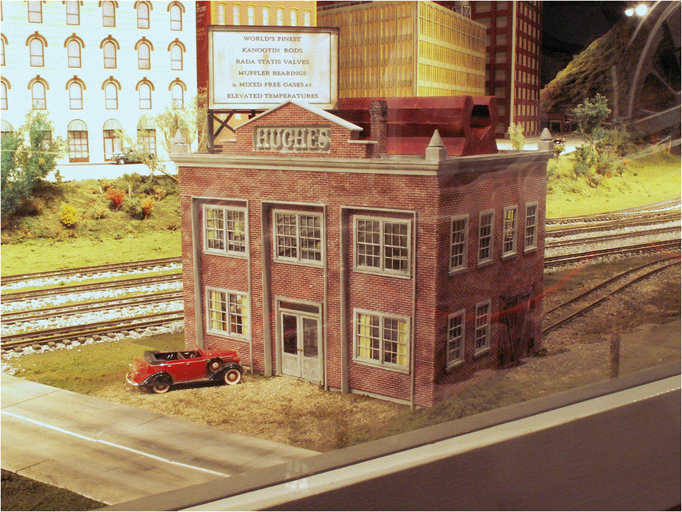 |
| Figure 16 The Hughes Manufacturing Company, 8 Dec 2008 |
That’s all I have on the subject for now, but I’m sure the changes and improvements will continue. As always, I encourage you to go see the layout, again and again. It’s always changing, and I hope you’ll agree with me that it’s changing for the better. Also, if you have mind to participate in making it so, come join the team; there’s always lots more to do and plenty of opportunity to use your skills and creativity.
© 2009 Tom Bartsch
MVGRS Big Train Project Coordinator

 Tickets
 Parties
 Shop
Shop Directions