#2 Status Report
October 6, 2006
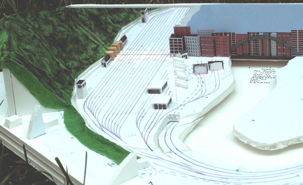
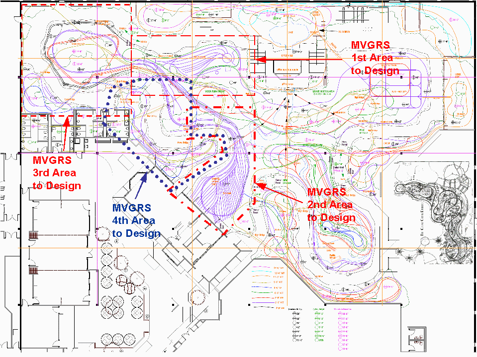
The Project IS moving forward. Despite a delay in the zoning approval for the site, now expected in September, support from the local government jurisdictions appears strong, and Don Oeters (the man with the money) has decided to proceed with getting the architectural (structural) planning done. MVGRS has been heavily involved in planning the layout, trying to define where the tracks go, at what level the supporting structure needs to be, and what access openings and depressions are needed in the structure. Our ideas have been warmly received, to the degree that we have been asked to take on additional design “assignments.” So far, we’ve successfully completed 2 ¾ of those assignments. (I’ll explain the ¾ shortly.) We’ve designed the “middle-era” (~1900 to 1950) engine servicing facility for both steam and diesel, including a turntable, a roundhouse, coaling station, and other related items. We designed the modern era (1950-present) yard, servicing facility, and intermodal facility (see the picture of our quarter-inch scale mockup in Figure 1, including a mirror to make the length of the yard look twice as long as it really is). We also designed the modern-era city, which still needs a bit of “adjustment.” Finally, we volunteered to design the remaining modern-era section between the city and the rail yard in the hope that we would be able to provide a unified and consistent concept that transitions smoothly from one scene to the next in the modern-era section of the layout. See Figure 2 for a view of the areas that we’re working on.
Figure 1

Figure 2

We provided our design for the modern-era city based on the original concept of aisles and layout areas. These will have to be reworked a bit due to the first feedback just received from the architects who have been hired to do the structural design supporting the layout and the other structural features, such as the overlook platform, bathrooms, the meeting rooms, etc.. Their evaluation of the overall layout concept indicated that the layout needs to have wider aisles, areas for seating, and larger areas for the public to stand, view, and wait in certain locations. Most notably, this last item affected the area outside the restrooms that are accessible from inside the layout area adjacent to the modern-era city. That’s why we’re not yet done with that assignment. Fortunately, we’ve come up with a solution that doesn’t require a complete redesign, but simply a move of the whole central area of the city by just a few feet (easy to do on paper). Figure 3 shows the preliminary mockup with the layout of the tracks, streets, building locations, and under-layout access holes for getting into the interiors of the buildings. In the future, we’ll add mockups of buildings to better show how it might look when completed. Along with the layout design, we’ve identified some concepts for animation and scenic details that would add interest. Things like people movers from the railway station into the city, pedestrians walking across skywalks, a helicopter on a hospital roof, and so on, all aimed at delighting the visitors who will come to see this layout.

Figure 3
Our ability to produce and flesh out some of these very large and complex designs speaks volumes about the talent, imagination, and creativity of the people working on this project. As always, ideas, comments, and contributions of time and effort from anyone who wants to participate are welcomed and are very appreciated.
This is going to be BIG and TERRIFIC! Join us and become a part of it!
© 2006 Tom Bartsch
MVGRS Big Train Project Coordinator

 Tickets
 Parties
 Shop
Shop Directions