#119 May Status Report
May 12, 2017
In this article, we’ll look at the recent upgrade to the Habush Grocery and Delicatessen in the EnterTRAINment Junction (EJ) layout’s Middle Period City (Figure 1). It’s located right next to the Grand Hotel, and is across the EJ aisle from the big locomotive wheels.
 |
| Figure 1. The Grocery and Deli before Upgrade |
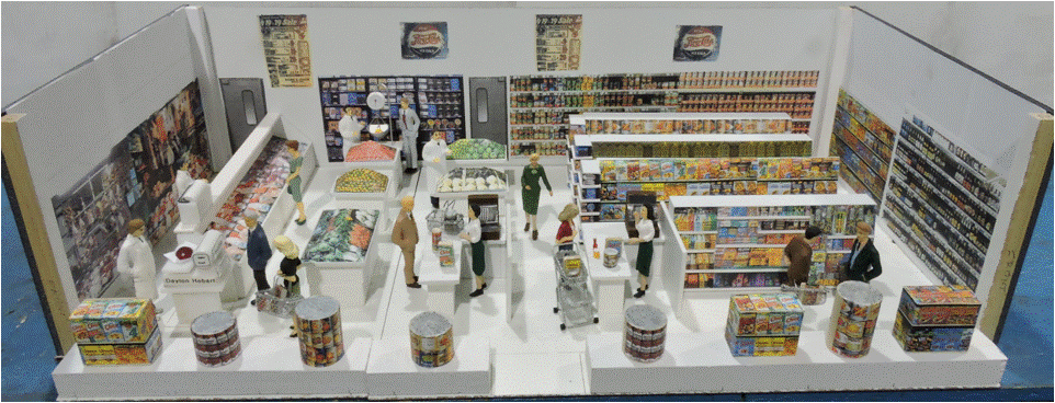
Figure 2 is an overview of the entire interior module. It had to be built in two sections to allow insertion into the building from below through the available access hole and movement into place at the front windows of the first floor of the building. The back wall and ceiling each were whole pieces for structural strength and to avoid having a visible dividing line.
 |
| Figure 2. Interior Overview |
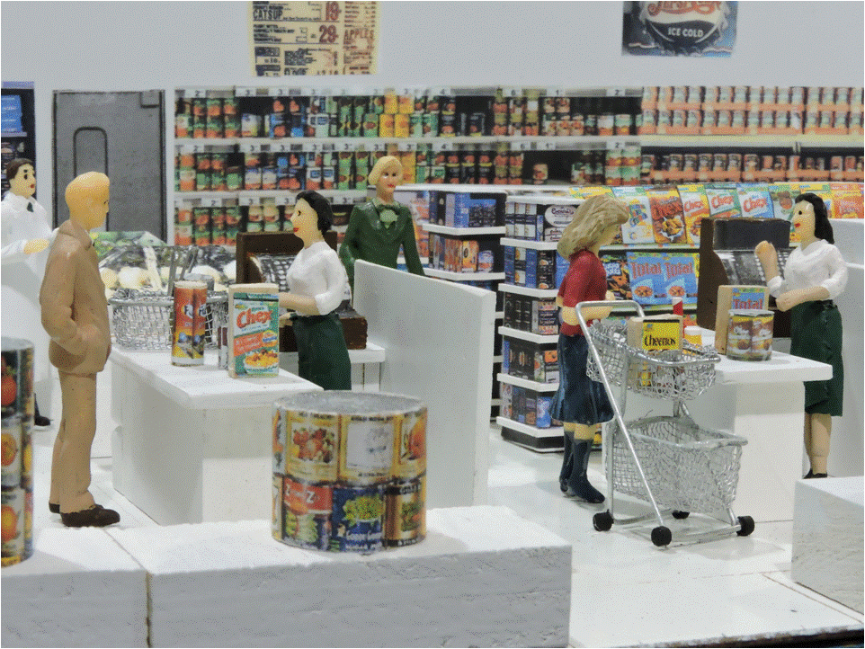
Figure 3 shows the details of one of the window displays of canned goods and of the check-out counters with their cash registers and helpful cashiers. Note the 1940s style grocery cart at the right. In those early days of grocery cart use, they were frames with wheels that had platforms for two removable baskets (we didn’t make the baskets removable on our model). Displays, fruits, vegetables, and packaged items were made of solid structures, box shapes, or can shapes and had pictures of the items glued onto them. At ten to twelve feet from the viewer, they look quite realistic.
 |
| Figure 3. The Checkouts with 1940s-Style Baskets |
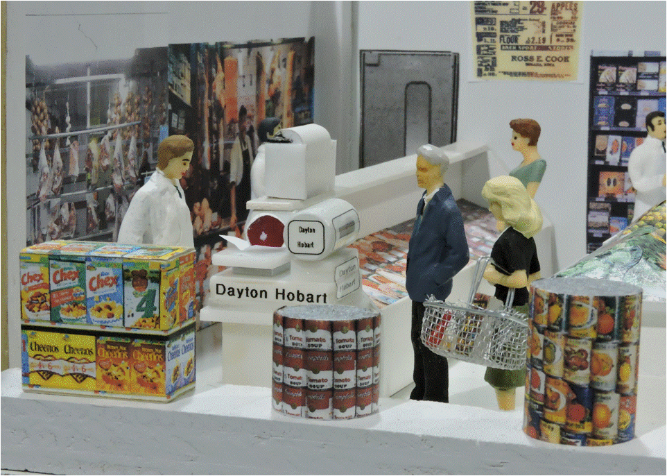
The meat department with its Hobart scale and packing paper dispenser represents the style of the 1940s, though the meat display case was similar to those that can still be seen in grocery stores of today (Figure 4).
 |
| Figure 4. The Meat Counter and Window Displays |
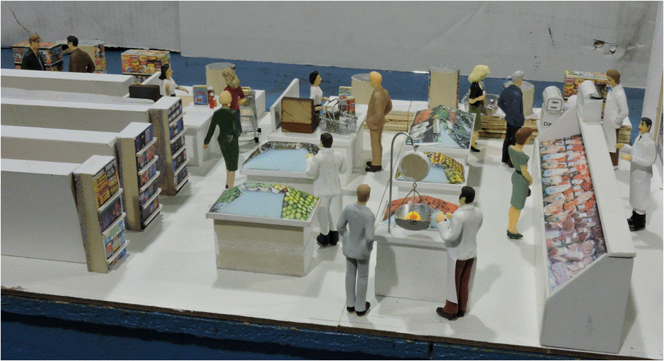
Because EJ visitors cannot see the backs of items in the store, little effort was applied to adding details to there (Figure 5). Fruit and vegetable displays were mounds of blue insulating foam with pictures of the display items glued to the front and side surfaces, and some portions of the backs. Note the aisles between shelf units at the left are much narrower than would be realistic. That’s selective compression, used to make the rear portion of the store look deeper than it actually is.
 |
| Figure 5. Grocery Interior Rear View |
Figure 6 shows the interior after installation. There is no clear view of the entire front, because of intervening trees, poles, figures, and vehicles. The fish monger with his following of cats remains a prominent item of interest in front of the store. To light the existing sign above the windows, a canopy was added above, with lights shining down on the sign.
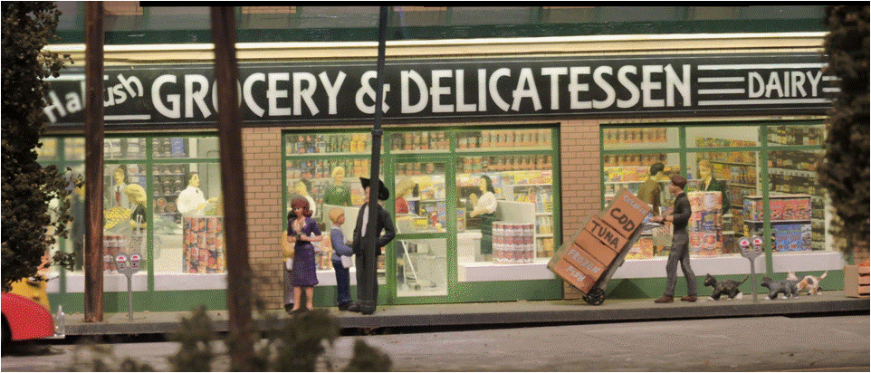 |
| Figure 6. Installed and Lit |
To make the interior more visible, the taxi, delivery truck, and black convertible on the street in front were moved just a bit so that they would block less of the views from the many directions the store can be seen from the EJ aisle (Figure 7).
 |
| Figure 7. With Staged Vehicles |
With another upgrade job completed, we’re already planning our next project, two doors down. Stay tuned.
© 2017 Tom Bartsch
MVGRS Big Train Project Coordinator

 Tickets
 Parties
 Shop
Shop Directions