#111 July Status Report
July 2, 2016
This month’s article finishes the entire tale of the EnterTRAINment Junction (EJ) layout’s Fox Theater upgrade. This time we’ll look at the interiors that were added to the street-level front half of the building and the signs that go with the businesses there. Only the front half of the building was upgraded, because the rear of the building is adjacent to another building and the windows on rear half on the side streets are not readily visible from the EJ aisles.
There are three businesses that needed to be addressed. On the left, as seen from the aisle, is the Airliner Diner. In the center is the lobby entrance to the Fox Theater, whose interior, in the center of the building, is not visible from anywhere. On the right was an unlabeled area, which the EJ volunteers determined would be best served by a tavern, which ultimately became known as “Finnegan’s Pub.”
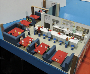
The diner (Figure 1), which used some of the same accessories and furniture used in the Elwood Grill addressed in previous articles (Numbers 99-103), was relatively easy to furnish.
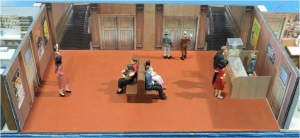
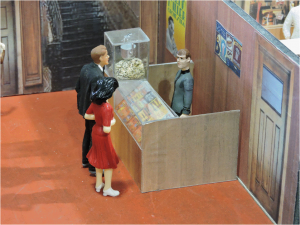
The Fox Theater Lobby was fairly plain (Figure 2). Movie posters on the walls, flat printed pictures of doors and stairs, and a set of benches were the relevant decor. The only challenging element was the construction of the candy counter, with its popcorn machine and glass display case (Figure3). Unfortunately, Figure 3 may be the best view you ever get of this detail, because it is very difficult to see from the EJ aisle, given all of the things in the way (doors, people, the ticket booth, and the sign-changer on his ladder).
The tavern was a significant and new challenge. It needed multiple bar stools, round tables, beer glasses with heads, and a pool table with players, pool cues, and other accessories, including a lighted clock (Figure 4). Making the bar stools was described in article Number 106. The round tables were made from large fender washers, glued to the heads of long roofing nails. The pool table was scratch built of wood with brown-painted window screen fabric simulating the leather net pockets. Pool balls were appropriately painted bird shot. There were three specially modified players, including one bending over to rack the balls. The beer glasses were shaped “clear” shrink-tubing, colored on the outside with yellow or brown marker and the tops dipped in white paint to simulate the foam head. When we described our intentions for the pub’s interior, one customer asked, “Will you include a “black and tan?” After getting an explanation of what that was, we did include it (look carefully, you’ll see it at the end of the bar).
The complete interior set is shown all together in the panorama in Figure 5. The work table it sits on is not really curved. The apparent curvature results from the wide-angle view from the slightly raised central location in front of the theater lobby.

Since we went through all of the effort to add lighting to theater sign and marquee, we thought it necessary to provided lighted signs for the diner and pub as well. The top right of Figure 6 shows the original Airliner Diner sign, which we were unable to adapt to lighting. Instead, it was replaced with a brand new sign (Figure 6 top right) made of translucent plastic and lit with LEDs from the inside. We also including an attention-getting model airliner (can you identify make and model?). Two signs were made for the pub, one facing the main street, the other facing the side street (Figure 6 bottom). After installation, we determined that the interior of the pub and both signs were far too bright, so variable resistors were installed to allow us to tailor the brightness to the appropriate level.
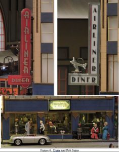
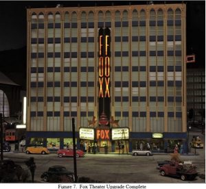
Figure 7 shows the job done (for now – July 2016). You never know what other ideas we’ll come up with in the future. Check it out the next time you visit.
© 2016 Tom Bartsch
MVGRS Big Train Project Coordinator

 Tickets
 Parties
 Shop
Shop Directions