
 Tickets
 Parties
 Shop
Shop Directions
#56 Status Report
October 24, 2011
In this installment we’ll take a different approach. We’ll look behind the scene of a single item, a building, showing how it’s constructed and why it was done the way it was.
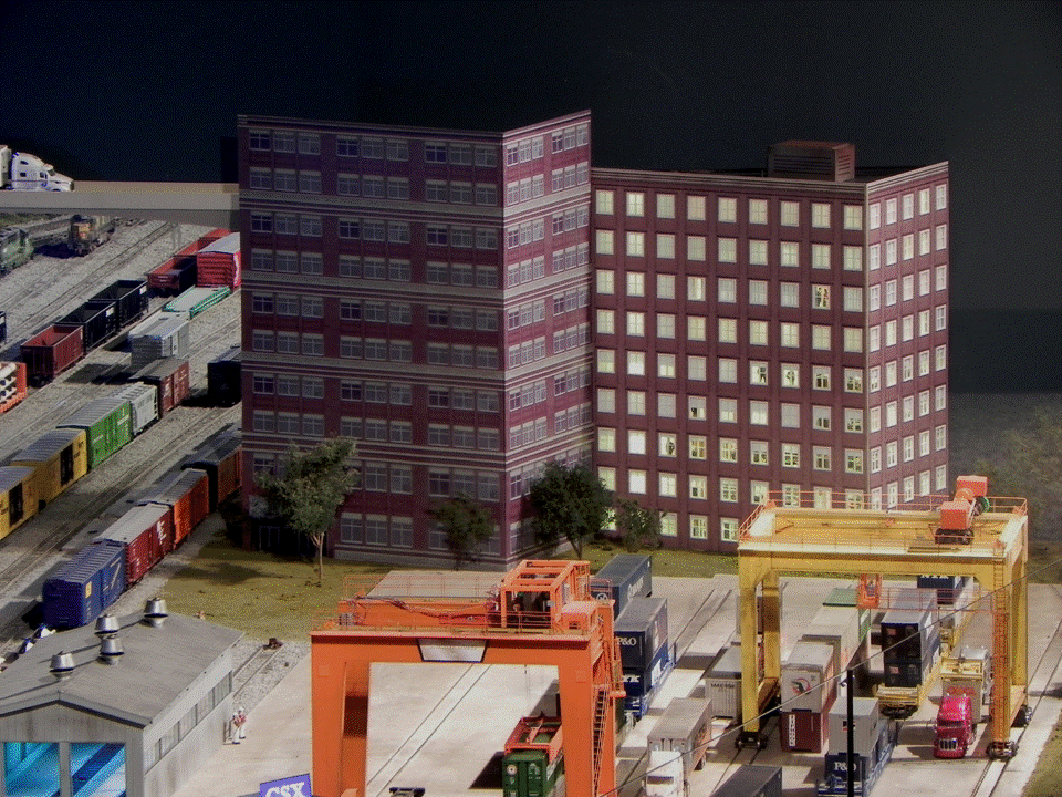
Before the upgrade described here, one of the last things you saw before exiting the EnterTRAINment Junction layout is a pair of flat façade buildings on the wall with the exit to the gift shop (Figure 1). Most of the layout buildings are being upgraded to include interior lighting to make them more presentable when the day-dusk lighting cycle is implemented in the layout. Because these façade buildings were close to the aisle they were in great need of upgrading. Both buildings were made of only two walls, with the remainder of each supposedly extending beyond the layout but “cut off” by the exit wall.
 |
| Figure 1. Exit Wall Façade Buildings |
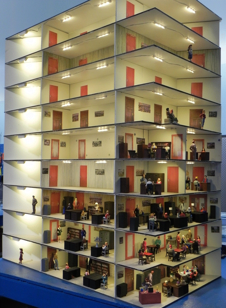
The building on the right was only about three feet from the layout’s aisle, and that proximity to the customer demanded a higher degree of detail than what would be appropriate for a far-background building. That meant interior furnishings and people would be needed to be visible through the windows where the shades and curtains were open. (Figure 2). Because the first floor would be at a height of 54” above the floor of the nearby aisle, the building’s upper floors would not be easily visible to a customer in the aisle. So, no interior furniture was needed on the upper floors, but doors and pictures on the walls would be visible and would provide some degree of realism. Also, because the longer of the two walls of the building was angled slightly away from the aisle, the interiors of the rooms at the far end didn’t need detail either. Attention was paid to minimizing direct visibility of the very bright LEDs lighting the interior. This was done mostly with simple paper shades adjacent to the lighting elements.
 |
| Figure 2. The Interior |
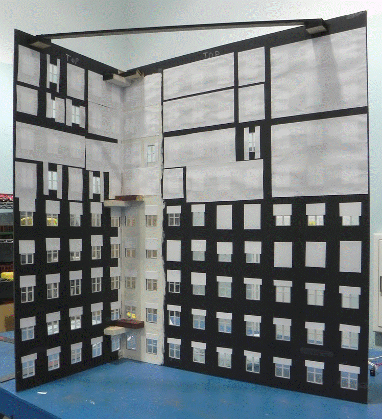
The two exterior walls were from a façade building that had previously been installed in the Modern City. The walls had holes cut for the windows and individual framed windows installed. The lower five floors were outfitted as offices, and there, windows had shades were used (Figure 3). The upper four floors were intended to be apartments/condos, and they had curtains over the windows, most of them closed. That last reduced the amount of interior detail needed on those floors. The façade stands up by itself and can be easily removed to allow access to the building interior if needed.
 |
| Figure 3. The Façade |
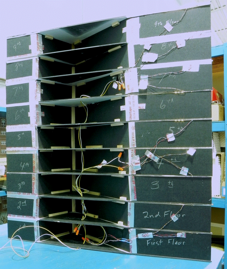
Since the back of the building would be against the exit wall, it didn’t need to be pretty, just functional. One of the key concerns was ensuring that there would be no light leaks which would show up bright on the exit wall behind the building. Aluminum tape was used to cover the joints and stop such light leaks (Figure 4). Each floor was constructed individually and assembled into sets of three which were then stacked to form the building’s interior. Wiring from the lighting was routed down the rear of the building.
 |
| Figure 4. Rear View |
Figure 5 shows the building complete and installed on the layout. The windows are fairly small, so the interior detail is not easily visible without moving one’s point of view when looking at the building from the aisle.
 |
| Figure 5. The Building Installed |
One of the considerations in the design was how the building would look as seen from the Mezzanine. Figure 6 shows you, but you’d best have a telescope or binoculars to see it this way.
 |
| Figure 6. View from the Mezzanine |
One building done. More to do.
© 2011 Tom Bartsch
MVGRS Big Train Project Coordinator