
 Tickets
 Parties
 Shop
Shop Directions
#124 October Status Report
October 12, 2017
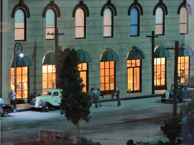
This month’s article is about the completion of the upgrade described in the Part 123 article. It shows the installation of the first floor interior of the EnterTRAINment Junction (EJ) layout’s Middle City “Piano Building,” shown in before and after views in Figure 1. There’s not much difference between these views, but read on.
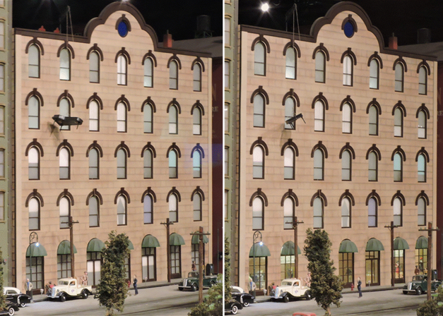 |
| Figure 1. The “Piano Building” Before and After Upgrade |
On closer inspection the interior detail becomes apparent, as does the sign in the window (Figure 2). Unfortunately, viewing the detail from the EJ aisle is hampered by intervening items like telephone poles, trees, and another building.
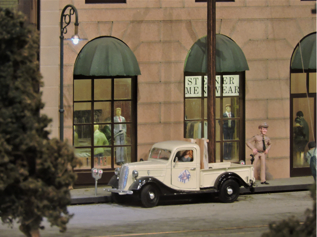 |
| Figure 2. The Menswear Store |
A case in point is the building’s lobby for the building’s tenants. To get this photo required raising the camera high enough so that it could look above the meat packing building in the foreground. Getting that height is hard to accomplish for EJ visitors (Figure 3).
 |
| Figure 3. The Lobby |
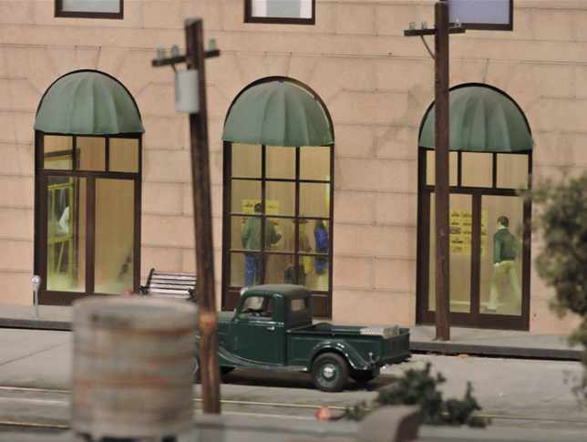
The interiors and store signs really show up well during EJ’s dusk lighting period, when the brightness of the interiors makes them stand out against the darker surroundings of the building (Figure 4).
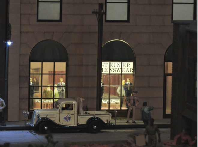 |
| Figure 4. Men’s Clothing Store Lighting |
Similarly, the interior of the ladies clothing store and its sign become much more obvious with the darkened background (Figure 5).
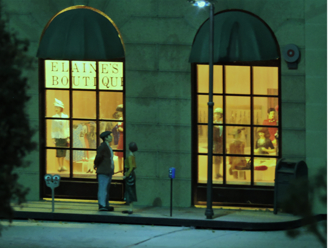 |
| Figure 5. Ladies’ Clothing Store |
You might wonder about the choices of names for the stores and the locations of the signs. There were constraints that drove those choices. The interior of the building had a frame just above the top of the first floor windows, which would have made mounting an exterior sign easy, but hiding the wiring for it much more difficult, not to mention the challenges associated with constructing such signs and lighting them. The windows were tall enough, that blocking the upper panes did not negatively impact the view of the interiors, so placing the signs in the tops of the windows became the method of choice. The names were chosen to be short enough so that they would need no more than three letters of ½ inch font per pane, and they had to sound sufficiently “classy” to be consistent with the up-scale style of the stores. “Bubba’s Togs” or “Ma’s Threads” would just not be right.
 |
| Figure 6. Piano Building Done |
With this installation complete (Figure 6), we’ve exhausted the available Middle City buildings whose interiors had sufficient access to allow removal of the window frosting and make insertion of interiors worthwhile. Even so, other projects await, so stay tuned.
© 2017 Tom Bartsch
MVGRS Big Train Project Coordinator